

It can all be interesting in the right context but how does F1 pick and choose what to show?
“It’s a fine balancing act. Across those two subsets of the hardcore and casual audience, you have divisions within those so even the people who are avid supporters and will watch every single grand prix, some of them care very little about either the data or the technical side of it in particular,” F1 consultant Rob Smedley explained to Motor Sport.
“Some of them you could fill the screen and it’s still not enough, there’s still not enough information there. So it’s a really tricky balancing act and it’s something that we’ve definitely learned as an organisation as we go along.”
Keeping viewers informed is difficult when the action unfolds over an hour and a half and sometimes relies on viewers having watched previous sessions or races for greater context. Equally, feeding viewers up to date information is crucial because out-dated info will only further complicate their viewing experience, so how does F1’s AWS graphics actually work?
Data from cars is beamed back to F1 HQ through the cloud and fed into a machine-learning algorythm. The data is processed and read by the machine which fires out the results to the broadcast centre and fed into the production graphics you see like the rev counter or gear selection over the top of the halo. That process in its entirety takes less than half a second.
Using those new graphics in tandem with what is unfolding on the TV is just a new method of engaging fans during a race broadcast.
Some are still miffed whenever they see the AWS logo pop up on a broadcast and the graphics indicate a possible change of leader, and F1 knows that too.
“You know what is really well appreciated and what is perhaps a little bit too dumbed down for your avid fan who has a voracious appetite for data, you know it’s just something that you’ve got to kind of ‘get’ on the journey.
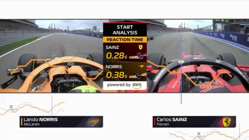
The newest Start Analysis graphic in action
F1 / Amazon Web Services
“You’ve got to initiate it if you like, and start to push stuff out there and see how well it sits. I would say up to now, what we’re seeing with the Insight graphics is that on the whole they sit really well.”
Perfecting the presentation is tricky too. While a driver’s tyres may be in the final 10% of their predicted lifespan, a strategy may require an extension of a few laps and accounting for out-of-the-box thinking can’t always be done through graphics shown as a race unfolds.
Picking and choosing what to show though is crucial for explaining the narrative of the race. Smedley says that while the graphics will never be perfect at predicting the outcome of a race, that can be a beneficial thing.
“There’s lots of different organic outputs of us presenting data to the public and then it’s giving them a slightly different, nuanced understanding of other areas of Formula 1, the much more technical area of Formula 1 that actually this is really difficult.
“So how do those guys on the pit wall make all the decisions? Well, what they do is they have to just be extremely good at their job and use their natural intelligence, augmented with data, tools and data assets to be able to then make better decisions and that’s all we’re really trying to do with these AWS Insights down at a fine level to allow you to make a more informed decision in how you consume a Formula 1 grand prix.”