How F1 hopes to rank the best drivers on the 2021 grid without car performance bias

F1

Formula 1 is a game of minute differences and details but the series aims to help fans gain further insight into just how closely-matched the 20 drivers on the grid truly are

F1 FP2 French GP

F1 drivers are closely matched but how would the top drivers do in the worst cars?

NICOLAS TUCAT/AFP via Getty Images

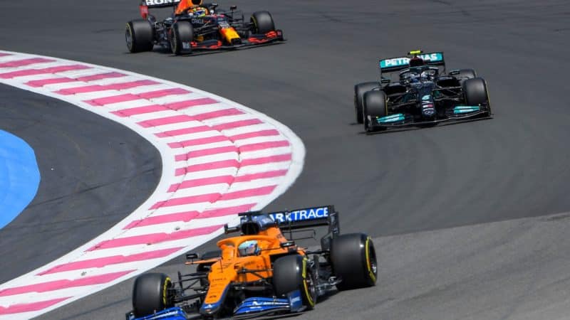
While Max Verstappen and Lewis Hamilton grab the headlines at the front of the grid in two of the fastest F1 cars in the history of the sport, debate carries on as to which is the better and faster driver, but what if there was a way to settle that?

Could, for instance, Nicholas Latifi actually be out-performing Esteban Ocon but his efforts are hidden due to the differential between the Williams and Alpine? Who really is the last of the late brakers?

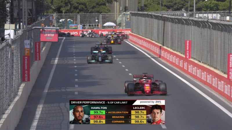
Formula 1 has introduced its newest AWS TV graphic this weekend ahead of the French Grand Prix. The new ‘Driver Performance’ race graphic hopes to solve these debates by giving fans accurate data into how much each driver is extracting out of their respective cars.

So while over a single lap the Haas may never get further up the grid than 19th, it could be that its drivers are some of the top performers on the grid, in theory anyway.


How does AWS Driver Performance work?

AWS insight f1 driver performance graphic

Driver performances in crucial areas of the lap can now be analysed and ranked against one another

F1 Insights by AWS

The newest graphic that has joined the AWS performance offering aims to display driver performance relative to their car.

For this, F1 has taken tyre performance data from the teams and estimated the maximum performance possible within each car’s potential. The drivers will then be ranked in three different areas against one another.

The data is extracted in real time from the tyres on each car and a maximum performance benchmark based on how close to the tyres limit a driver is pushing.

Braking, corners and acceleration are all ranked out of 100% depending on how close each driver is to the tyre limits in each phase of their lap across each of the parameters of analysis.

So while a Mercedes might be in the low 1min 32s during qualifying versus the Williams in the 1min 34s, Valtteri Bottas could only be using 97.9% of his possible braking performance versus the 99.6% George Russell is extracting from his Williams.

Related article

F1 hopes to demonstrate the minuscule differences between each driver on the grid and highlight the strengths relative to others in how they make up their lap time.

The graphic opens the door to plenty of debate as well. If a driver is able to consistently extract close to the maximum from their cars in lesser machinery, how would they do in top cars on the grid?

“In order to get to this percentage of maximum car performance, we have had to build some complex car and simulation models,” F1 expert consultant Rob Smedley explained.

“The principal element that to look at was the front and rear grip available to the driver. If we were able to calculate this then this would give us the performance envelope of the car.

“We would then need to calculate the actual grip, so in reality, how much the driver is actually using. By comparing the two numbers we end up with the percentage values.”

In order to build the maximum performance benchmark, data is extrapolated from sensors on the cars such as speed sensors and accelerometers and a parametric tyre model is then used to build the picture of the maximum force each tyre is capable of generating in various car conditions.

From there, each driver is assessed versus their theoretical maximum performance benchmark and ranked in a percentage.

Is Hamilton better than Verstappen? Is the opposite true? Perhaps the new driver insight graphics could help settle or stoke the fires of the debate.