F1 race contracts: How long each circuit will stay on the calendar
As F1 expands globally, the future of each grand prix depends on complex, evolving contracts between race promoters and commercial rights holders, with some circuits secured long-term and others facing uncertainty
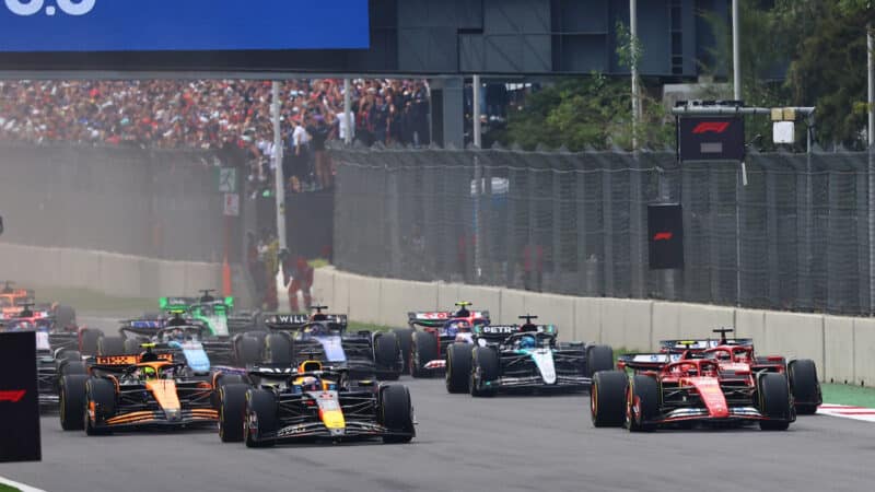
Mexico has secured a new contract until 2028
Grand Prix Photo
The Formula 1 calendar is made up of a complex web of contracts between race promoters and commercial rights holders. As F1 continues its global expansion, the contractual landscape of each grand prix has become a crucial factor in shaping the championship’s future.
While some iconic circuits like Monaco, Monza, and Silverstone have secured their places on the calendar for years to come, others face an uncertain fate, with deals set to expire soon and negotiations ongoing.
Here we explore the current contractual situation of every grand prix.
Australian GP
Melbourne became the home of the Australian Grand Prix in 1996, replacing Adelaide, which had hosted the race for a decade.
The event, whose previous contract was until this season, secured a 10-year contract extension in 2022 and will remain on the calendar until at least 2035.
Melbourne didn’t host an F1 race in 2020 and 2021 as a result of the Covid-19 pandemic.
Chinese GP
China was also absent from the Formula 1 calendar from 2020 to 2023 due to the pandemic, but finally made a return last year.

China returned to the calendar in 2024 after a three-year absence
Grand Prix Photo
Celebrating its comeback, the Shanghai International Circuit secured a new, five-year extension at the end of 2024, meaning the race is safe until at least 2030.
Japanese GP
Japan was another country that secured a new deal with Formula 1 last year.
The country also signed a five-year extension that secured its place on the calendar until at least 2029.
Bahrain GP
Bahrain has one the longest contract of all the races on the current calendar, having signed a new deal in 2022.
The country is set to host an F1 race until at least 2036.
Saudi Arabian GP
One of the latest events to enter the Formula 1 calendar (2022), Saudi Arabia has a contract until 2030.
The race has been held at the Jeddah circuit, but it is expected to switch to the Qiddiya complex in the future, although there is no date for the move yet.
Miami GP
Miami joined the F1 calendar on the same year as Saudi Arabia, 2022, and had a 10-year contract that extended until 2031. That was renewed in 2025 for another 10 years, making it the race with the longest contract, until 2041.
Emilia Romagna GP
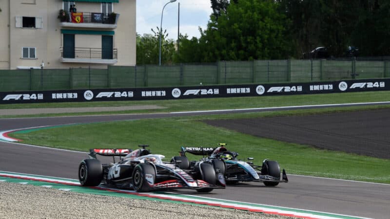
Imola hosted its final F1 race in 2025
Grand Prix Photo
Imola made a return to the calendar as a replacement for the cancelled races during the Covid pandemic and its contract expires after this year’s event.
The race won’t be part of the calendar in 2026, although a return in the future hasn’t been ruled out.
Monaco GP
Formula 1’s most iconic race signed a new contract in 2024 and will remain on the calendar until 2031.
Spanish GP
The Spanish GP will change venues in 2026, with Barcelona – which has hosted the race since 1991 – losing it to Madrid, which will enter the calendar next year.
Barcelona still has a contract for 2026, meaning its race needs to be renamed.
The Spanish city could also be part of the rotating system F1 is set to use in the future, although Barcelona recently ruled out the idea.
Canadian GP
Montreal landed a new deal in 2017 to stay on the calendar until at least 2029, then extended it until 2035.
Austrian GP
The Red Bull Ring has a contract until 2030 after having agreed a new deal in 2023.
British GP
Another venue to secure a new contract in 2024, the British GP has a safe place on the calendar until 2034, having signed a 10-year agreement.
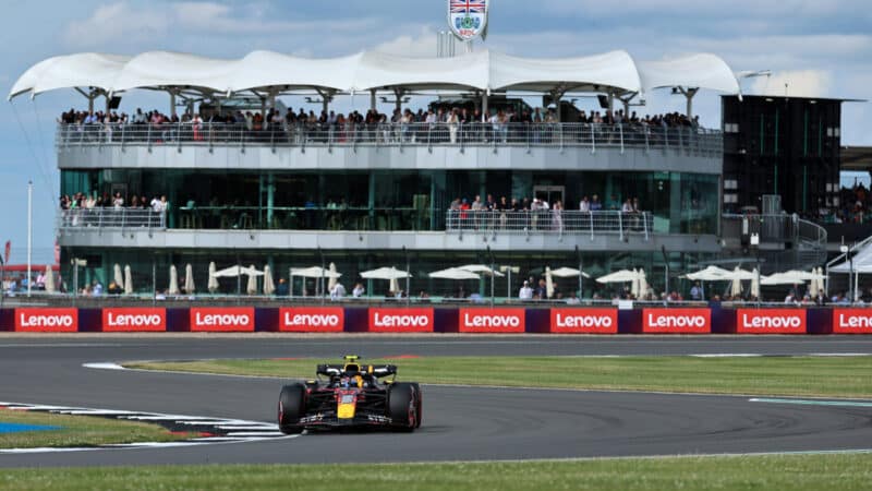
Silverstone’s place on the calendar is safe for a while
Grand Prix Photo
Belgian GP
Spa was the first race to join Formula 1’s rotation plan, signing a deal until 2031, but not hosting a race in either 2028 or 2030.
It is yet to be announced which venue Belgium will be alternating with, but it is expected to be another European race.
Hungarian GP
In 2023, Formula 1 agreed a five-year contract extension to keep the Hungarian Grand Prix on the calendar until 2032.
The deal was agreed after the Hungaroring committed to upgrading its facilities, including a new pit building and main grandstand.
Dutch GP
Zandvoort will host its final Dutch Grand Prix next year, as the race promoter decided not to be part of the calendar beyond 2026, despite the event being one of the candidates for the rotating system.
Italian GP
Having secured a six-year contract extension last year, Monza will remain on the calendar until at least 2031.
Azerbaijan GP
Azerbaijan signed a three-year deal in 2023 and is scheduled to host an F1 race until 2026. Beyond that, its future remains uncertain as it continues to be one of the races with the lowest attendance.
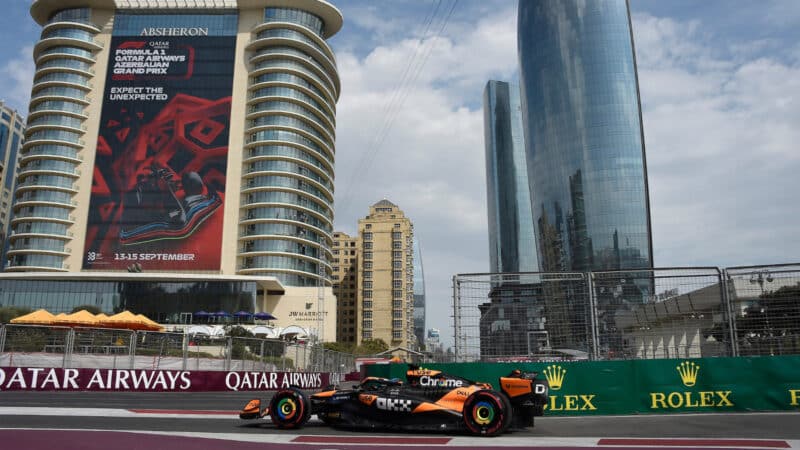
Does Baku have a future beyond 2026?
Grand Prix Photo
Singapore GP
Singapore has its place secure on the calendar until 2028, having agreed a new seven-year deal in 2022.
United States GP
The Circuit of the Americas is one of three F1 races currently hosted in the United States, and its place on the calendar is secure only until 2026, having signed a five-year deal in 2022.
Mexican GP
At the time of writing, Mexico is the latest venue to have secured a new F1 deal. The Mexico City event has extended his contract until 2028.
Brazilian GP
Brazil signed a new contract in 2023, extending its stay on the Formula 1 calendar until at least 2030.
Las Vegas GP
The latest US venue to join the calendar, Las Vegas initially signed a three-year contract that expires in 2025, but with a 10-year option that should be extended this year.
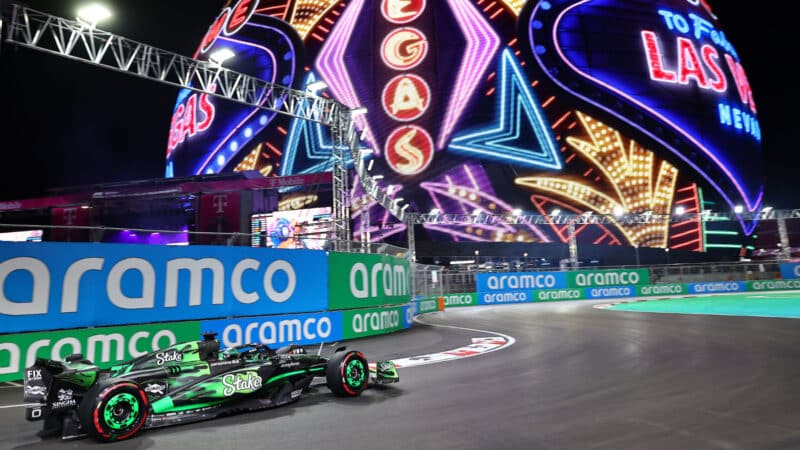
Las Vegas should be extending its deal after 2025
Grand Prix Photo
Qatar GP
Qatar joined the F1 calendar in 2021 on a 10-year deal that was paused in 2022 because of the World Cup, but is scheduled to remain there until 2032.
Abu Dhabi GP
The traditional season finale has a contract until 2030, having agreed a new deal in 2021.