Data that reveals Nyck De Vries's stellar pace — plus Williams' secret sauce
Nyck de Vries drove into the points on his F1 debut at the 2022 Italian Grand Prix. With data from Project F1 we reveal why his drive was so impressive — and how Williams nailed the strategy

De Vries is hot property after Monza drive
ANP via Getty Images

Two brilliant drives by two Dutchmen marked out the Italian Grand Prix. Max Verstappen’s victory came as little surprise, but Nyck de Vries‘s drive to ninth place in the Williams came out of the blue.
Last year’s Formula E champion scored points on his F1 debut, despite only being called up to replace Alex Albon with hours to go before qualifying.
Plenty went his way in the race, including the late safety car that spared his sore shoulders, but we have examined the race data to show how De Vries put himself in the best possible position to maximise what Williams had given him: a Monza-happy car and the best strategy on the grid.
The Italian GP story
Chart 1 Cumulative delta plot
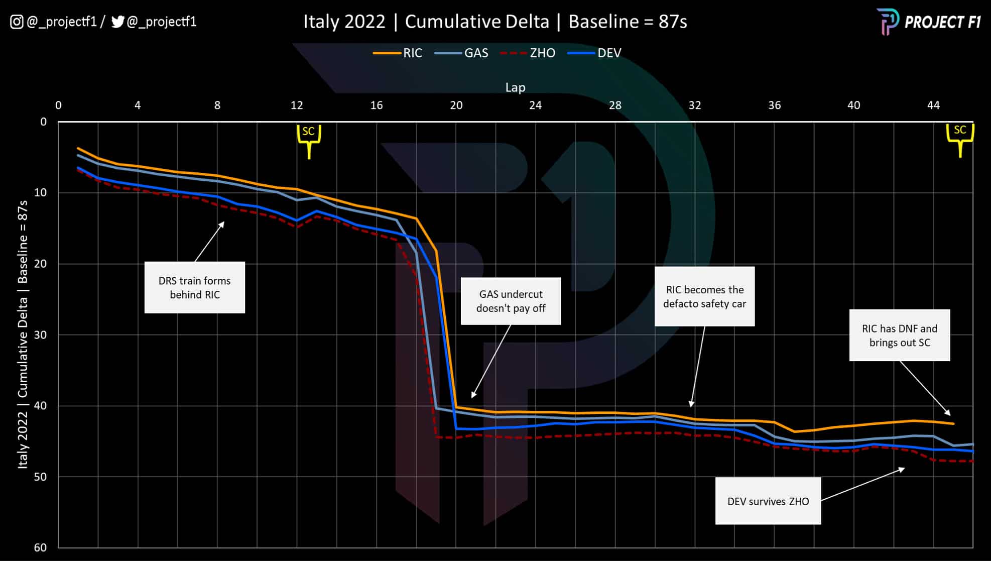
The lacklustre battle for the tail-end points is evident in the graph above, which illustrates how the DRS train-effect left drivers trapped in position.
The cumulative delta graph plots the average lap time for each driver as the race progresses, shown against a 1min 27sec baseline.
It’s clear that Daniel Ricciardo had a dual role throughout the race as a safety car for this pack, holding up the drivers behind, who were unable to overtake because each could activate DRS courtesy of the car in front.
The effect was potent and dictated the performance of Pierre Gasly, De Vries and Zhou Guanyu.
Gasly’s undercut attempt to get past Ricciardo was well intentioned but ineffective. The decision to pit early wasn’t helped by a slow stop, but even without this the AlphaTauri was unlikely to have passed Ricciardo when he made his stop.
All of this meant that De Vries’s game turned from offence to defence, as Zhou remained hot on his heels for most of the second stint.
As such the race came down to two elements: 1) starting position and 2) ability to manage the tyres.
De Vries’s brilliant qualifying lap
Chart 2 Qualifying best sector breakdown
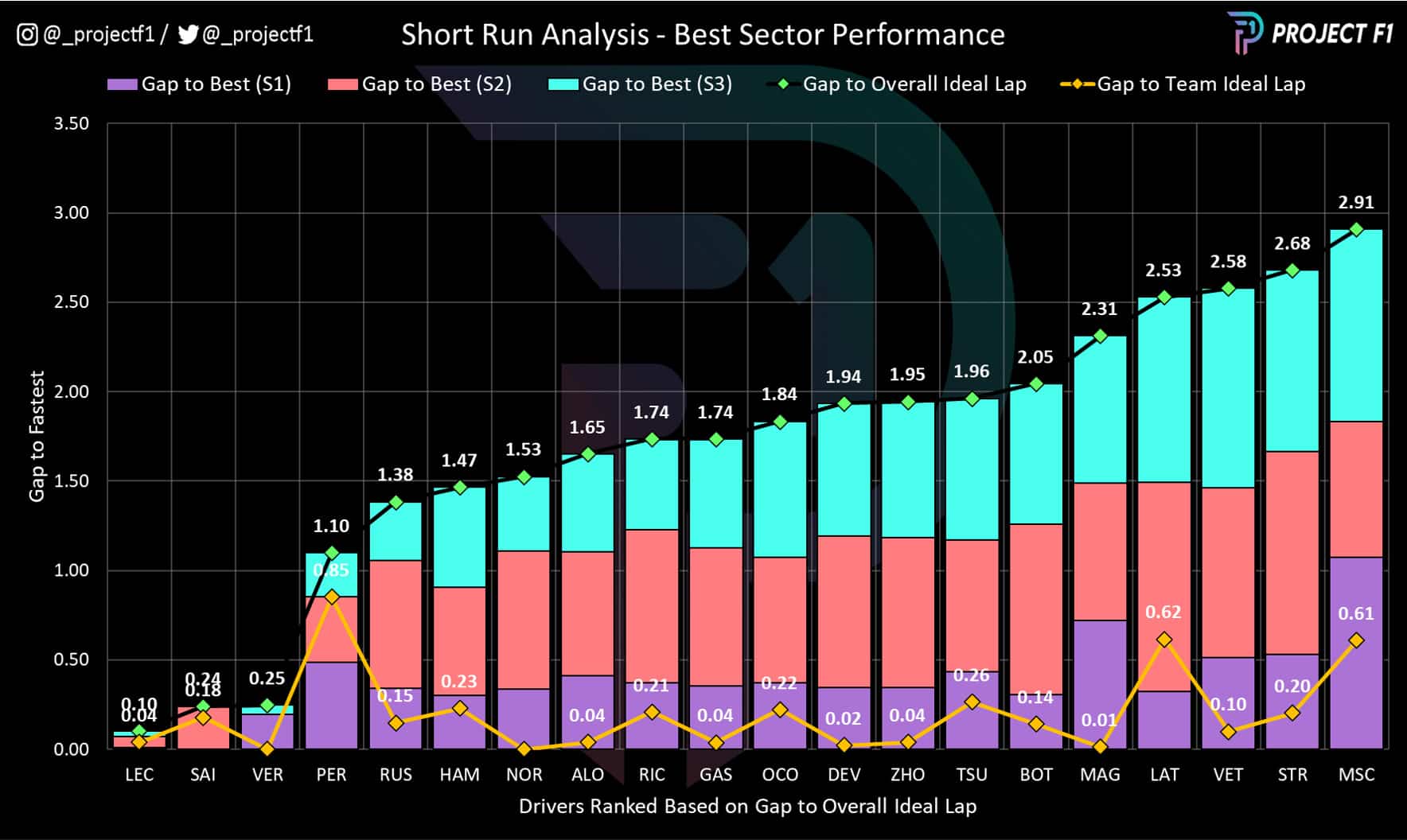
In order to fully appreciate De Vries’s performance, we have to look to Saturday’s qualifying session. De Vries had the legs to get the Williams out of Q1 and finish qualifying 13th fastest. Once all the grid penalties were said and done, De Vries would inherit a starting grid slot of eighth.
His performance was stellar, particularly when measured against his team-mate Nicholas Latifi.
Chart 2 uses the best sector times set in qualifying to see how close drivers got to the ideal lap — both overall and for their own car.
It highlights how De Vries was significantly faster than his team-mate in sectors 2 and 3 while marginally trailing in sector 1. Putting this together, De Vries was only 0.02 seconds away from Williams’ theoretical best lap time while Latifi was a whopping 0.6 seconds back from the benchmark.
Zooming out further, this gulf in performance meant that De Vries was much closer to the likes of Ocon in the Alpine while Latifi was just managing to clear the draggy Aston Martins.
These small gains were crucial, as it catapulted De Vries into a starting position from where he could make an impact using the natural advantages of the car and maximise the benefits of strategy.
How Williams nailed De Vries’s strategy
Chart 3 Tyre strategy summary
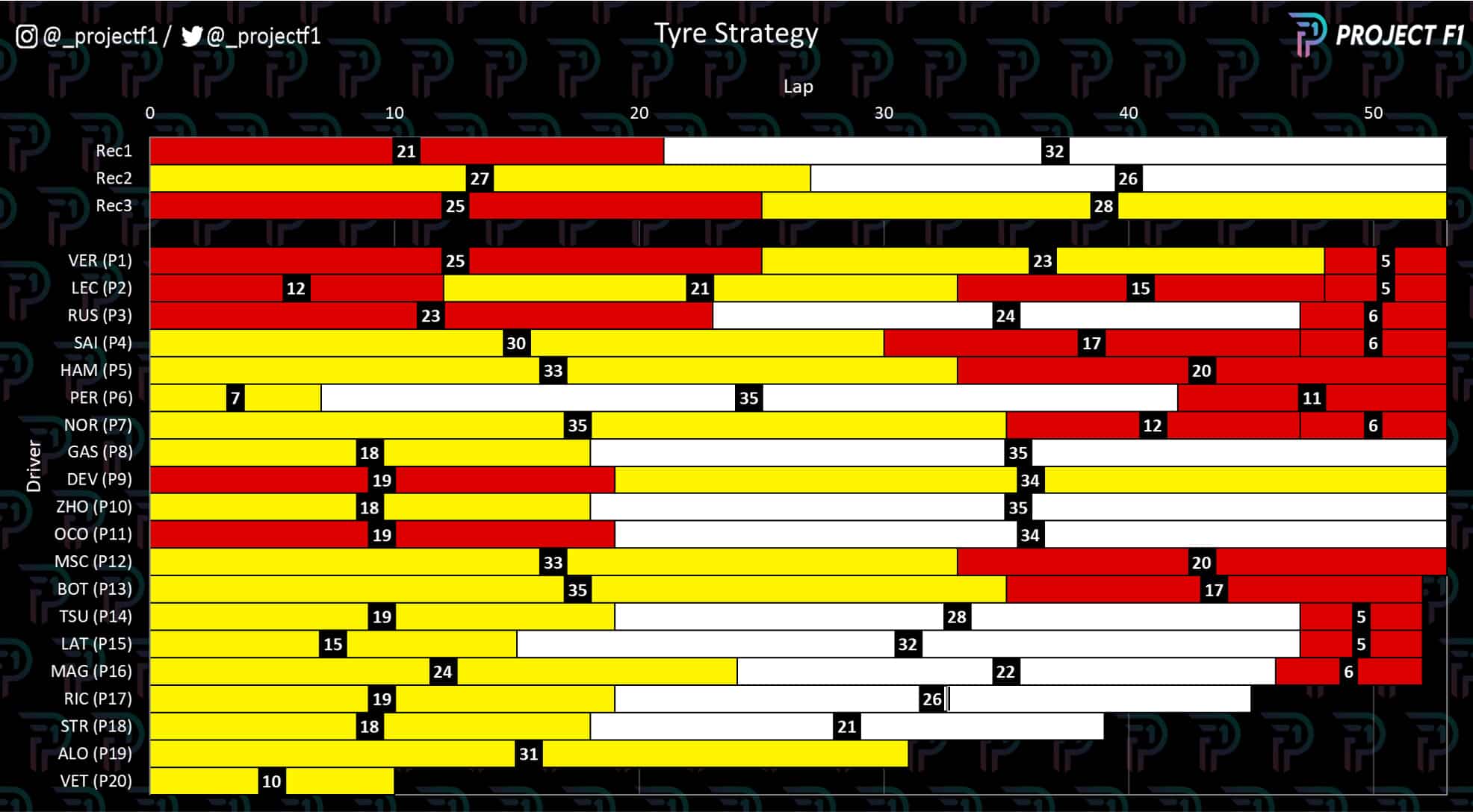
Chart 3 above highlights the secret sauce to De Vries’s debut points finish – the soft-to-medium tyre strategy. Not only was this a one-stop strategy, but it was one that maximised Monza’s low degradation qualities against competitors that opted for a safer and more conservative medium-to-hard strategy.
Although it was one of the three strategies recommended by Pirelli (shown at the top of the chart), De Vries was the only driver to opt for it. Schumacher and Bottas went for the reverse medium-to-soft approach.
The contrasting fortunes between these two strategies came down to starting grid position – hence why De Vries’s qualifying was also a crucial component to the recipe.
Soft tyre proved superior
Chart 4 Tyre degradation compared
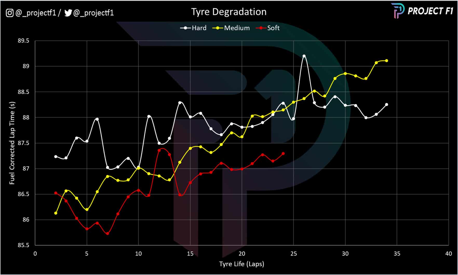
The soft tyre performed much better than expected – both in terms of pace and longevity. Further to this, the hard tyre’s durability was left unrewarded with lacklustre pace.
This is clearly seen in chart 4, which takes into account the reducing weight of fuel over the race to illustrate how tyre wear affected lap times.
The soft tyre is seen to deliver competitive pace deep into the first stint. The same goes for the medium tyre when compared to the hard tyre – only losing ground after 27 or so laps (about half the race distance).
De Vries matches his rivals’ pace
Chart 5 First stint comparison
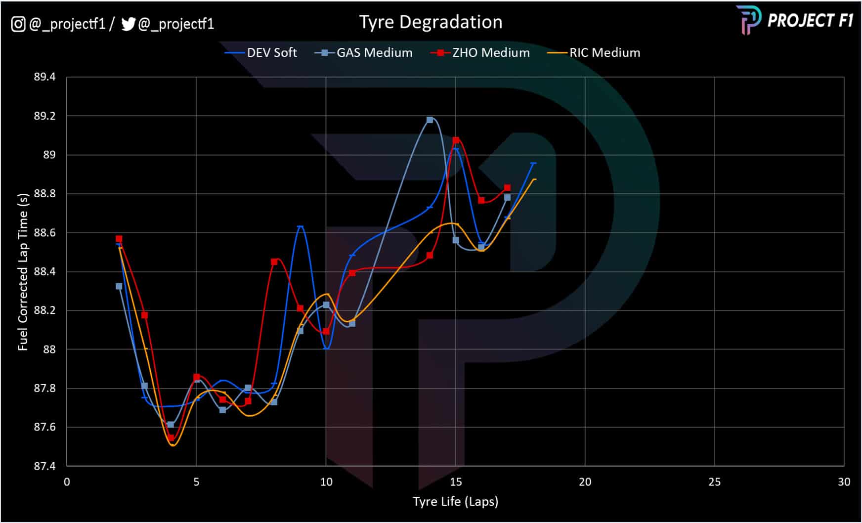
After understanding the general characteristics of each tyre compound, we can then apply it to the context of De Vries’s battle for the points. Charts 5-7 look to compare and contrast De Vries’s pace against his peers.
Starting with the first stint, shown in chart 5, we can see the clustered outcomes between the four drivers in question. But it’s worth remembering that De Vries’s trace is based on the soft tyre not the medium. Put another way, De Vries needed the soft tyre advantage to lap at the same pace as the others.
Chart 6 Second stint comparison
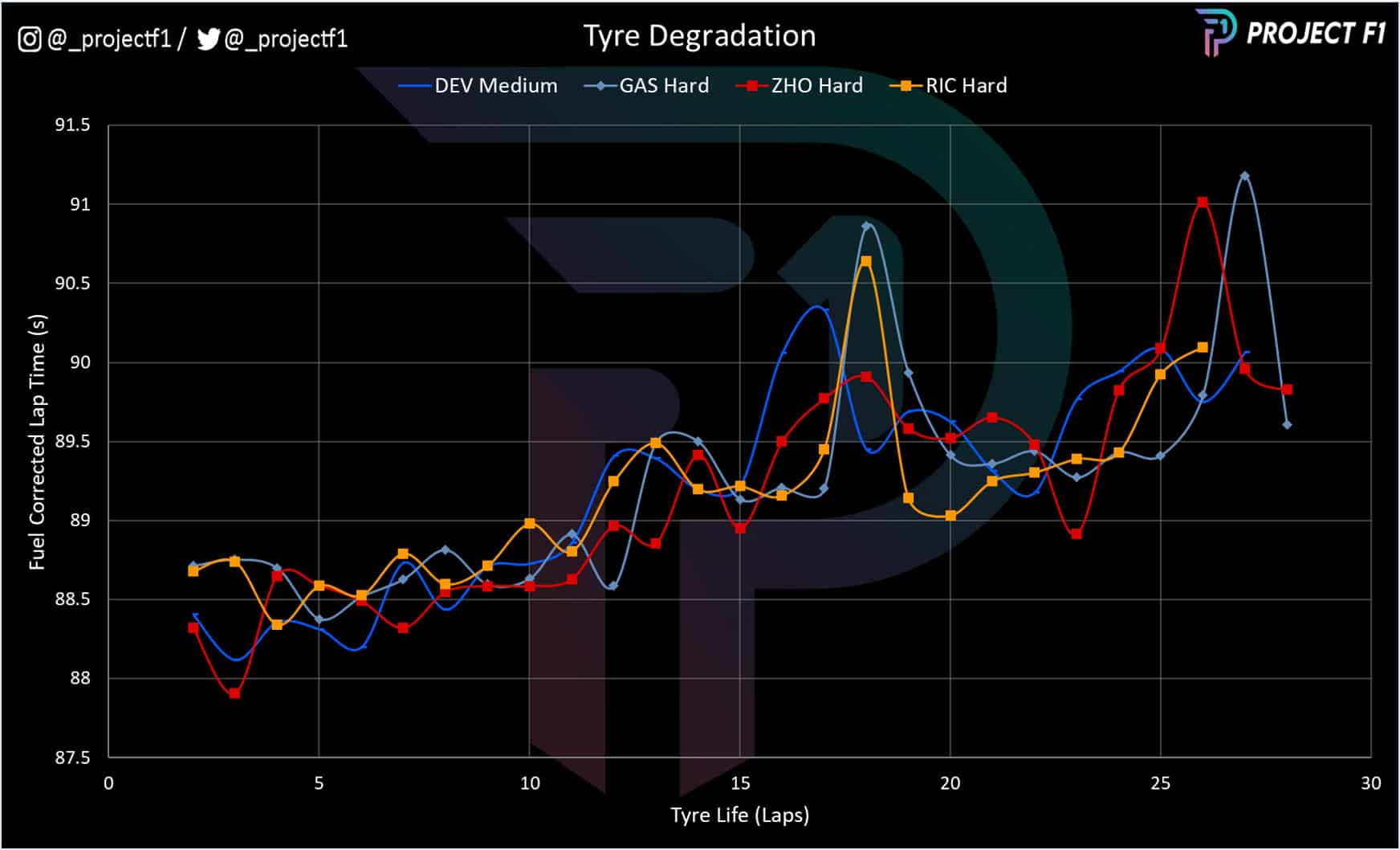
This theme continues in the second stint, chart 6, where De Vries’s pace is comparable to that of his peers. Once again, this is down to having the advantage of the medium tyre against the hard.
Typically, both the soft and the medium tyre would show a worsening profile over time when compared to their harder counterparts. But this isn’t evident due to Monza’s low deg nature.
Chart 7 Medium tyre comparison
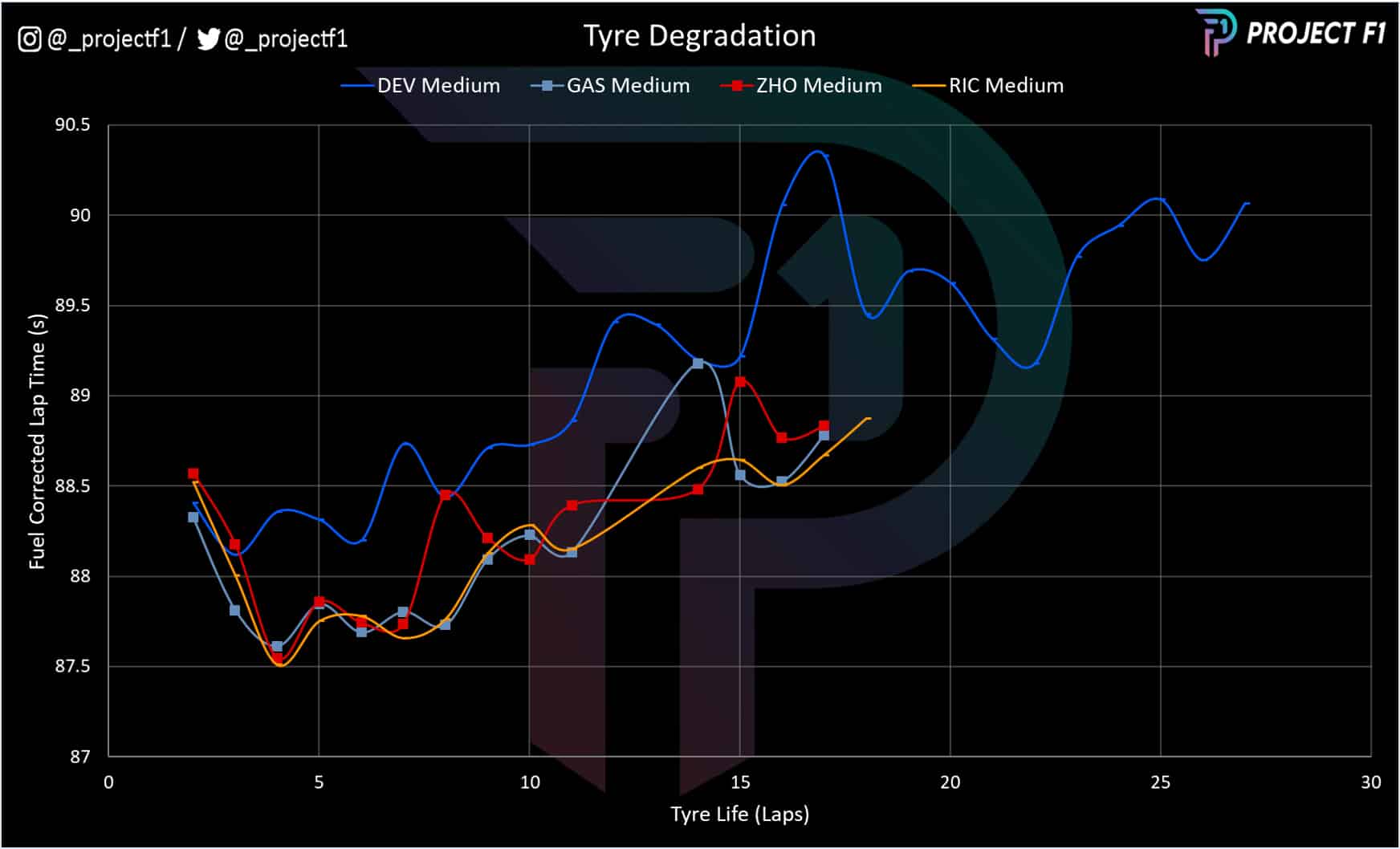
Look at this on a like-for-like basis, comparing the medium stints from all drivers and the Williams’ performance shortfall is clear to see.
The soft-to-medium strategy was instrumental to De Vries being able to hold on to the points paying position as shown in Chart 1 earlier.
Performance throughout the race
Chart 8 Trend race pace compared
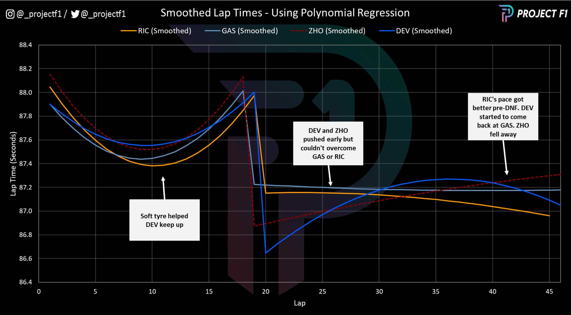
While fuel-corrected laps help understand tyre degradation, fuel burn remains an important factor when considering pace and strategy toward the latter stages of the race. Chart 8 preserves the fuel burn effect and plots the trend pace in the race.
Overall, the pace between the drivers is relatively comparable. What’s interesting is the difference in aggression during the second stint. Gasly and Ricciardo bring in the new tyres more conservatively compared to De Vries and Zhou. Given Ricciardo’s role at the head of the DRS train, the more aggressive approach failed to bear any fruit.
In fact, the approach left Zhou worse for wear toward the end of the race, while De Vries was starting to gain some performance – likely helped by Gasly getting caught up by blue flags.
In any case, De Vries was able to survive the difficult middle portion of the second stint to hang on until Ricciardo ground to a halt on the side of the road at the run down to Parabolica. The ensuing safety car would be the final piece of the puzzle to help take De Vries and his sore shoulders to a debut points paying position.
Somebody help that man! @nyckdevries was elated but also exhausted after Sunday's race 😀😰#ItalianGP #F1 pic.twitter.com/XVaAonAbz3
— Formula 1 (@F1) September 11, 2022
Project F1 turns data into graphics that uncover race pace and strategy
See more analysis at @_ProjectF1 on Twitter or @_ProjectF1 on Instagram