The data that shows why McLaren had to let Ricciardo go
Daniel Ricciardo's unhappy time at McLaren will come to an end this season – we look at the data which shows the team had no choice but to make a change

Ricciardo has struggled to match Norris and Help McLaren in the constructors' battle, as the data shows
McLaren
There are no two ways of looking at it – Daniel Ricciardo has significantly underperformed during his time at McLaren.
Despite getting a win at Monza last year, 2021 was below par, and the Australian’s 2022 drives have been even worse, eventually pushing the team to look at an early termination of the Australian’s big money contract.
The further drop off in Ricciardo’s pace has meant McLaren is making hard work of maintaining fourth place in the championship ahead of Alpine – with his team-mate Lando Norris doing all the heavy lifting, keeping it four points ahead.
In exhaustive detail below, we dig into the data that shows just why McLaren felt it had no choice but to seek an alternative to Ricciardo, which is now looking likely to be young Australian hotshot Oscar Piastri.
Chart 1: Points swing
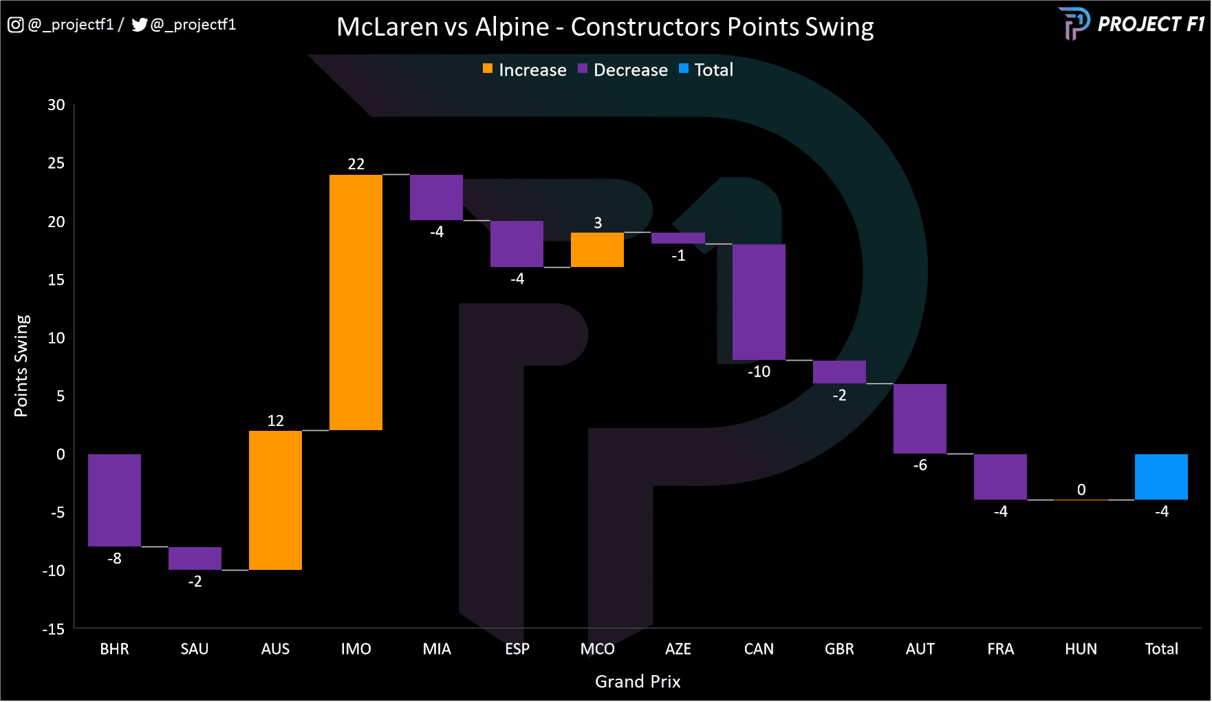
As the chart above shows, Alpine capitalised on McLaren’s early brake woes to take a 10-point lead over its rivals.
However, a set of strong results in Australia and Imola as well as some mechanical issues for Alpine put McLaren back on top.
Alpine then started to find its feet and had a strong run of momentum from Azerbaijan onwards – constantly chipping away at the points gap until it established a lead at the French Grand Prix. The gradual upgrades introduced by the Enstone team have clearly worked.
Chart 2: Points contribution
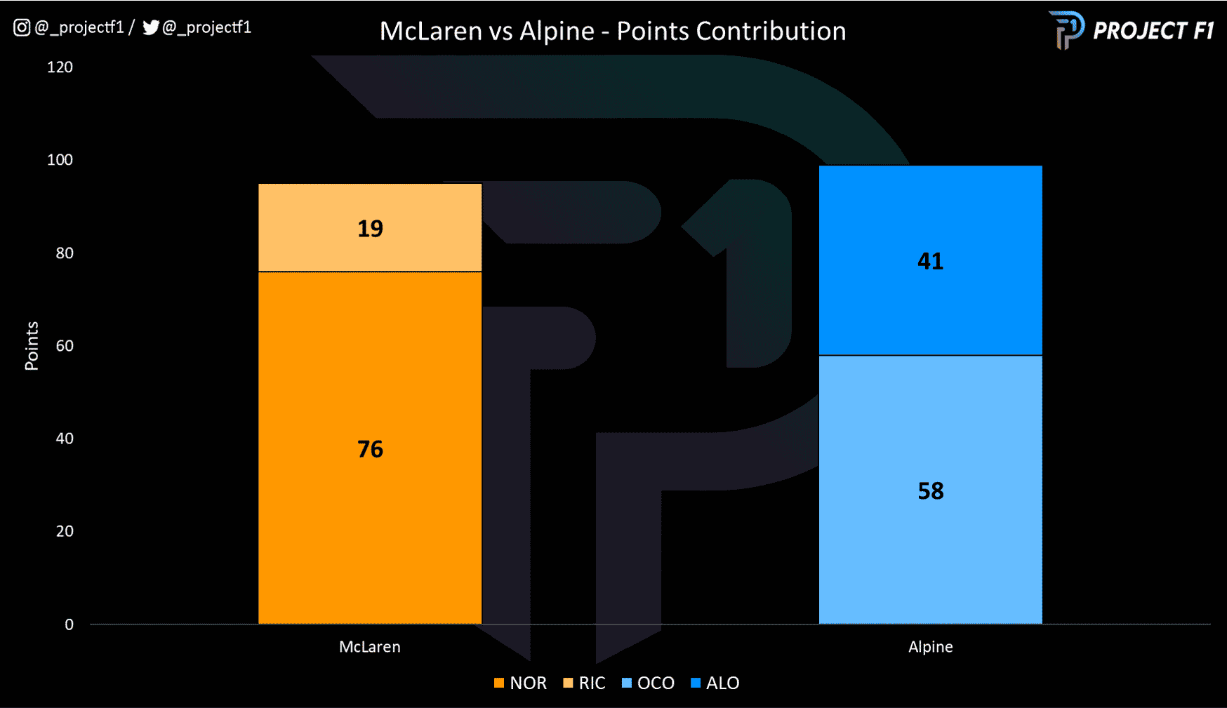
Looking a layer below the constructor points tally and you’ll see there is a stark difference how the points are distributed amongst the drivers. Alpine is close to a 50/50 while the lion’s share of McLaren’s points comes from Norris, not Ricciardo.
The disparity in the performance of the two McLaren drivers has been a popular storyline amongst the press but what are the key contributors to this?
Let’s start with qualifying:
Chart 3: Qualifying results
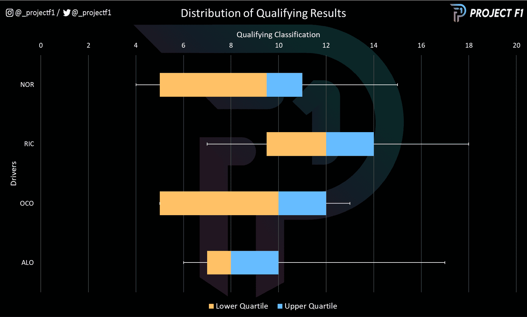
There is a fair degree of dispersion in the qualifying results amongst all drivers. Norris has had the best overall result and the second best (median) outcome.
Alonso has performed better from a median perspective and has the narrowest interquartile range – pointing to his consistency.
Ocon follows suit and Ricciardo heads the rear – with a median result that is worse than the Frenchman’s times.
Chart 4: Qualifying pace comparison
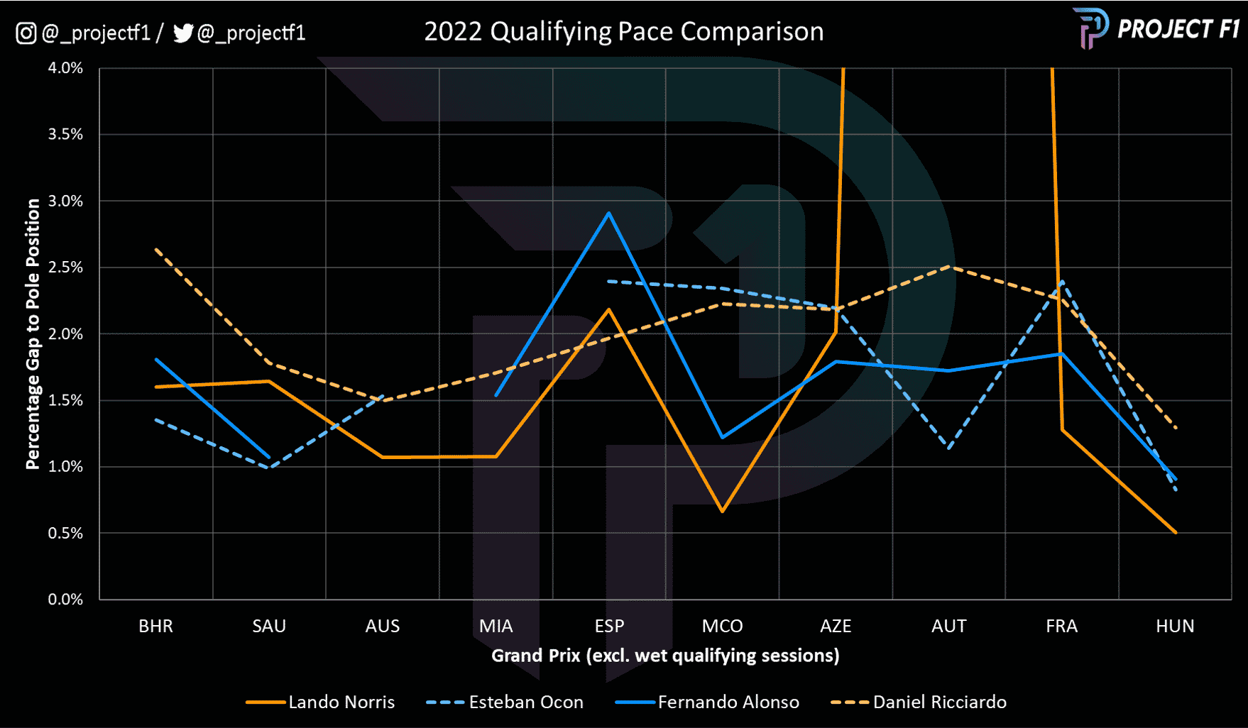
Looking at the actual qualifying pace (expressed as a percentage gap to pole position) and the advantage has waxed and waned between McLaren and Alpine.
Ocon and Alonso have traded advantage over the season with the Spaniard just besting his younger team-mate. In contrast, Norris has clearly dominated Ricciardo, with the exception of Spain (where the Brit was suffering from severe tonsillitis) and Austria (though the edge in Spain was small with all drivers lacking pace and Norris having issues in Austria).
Chart 5: Assessing peak performance
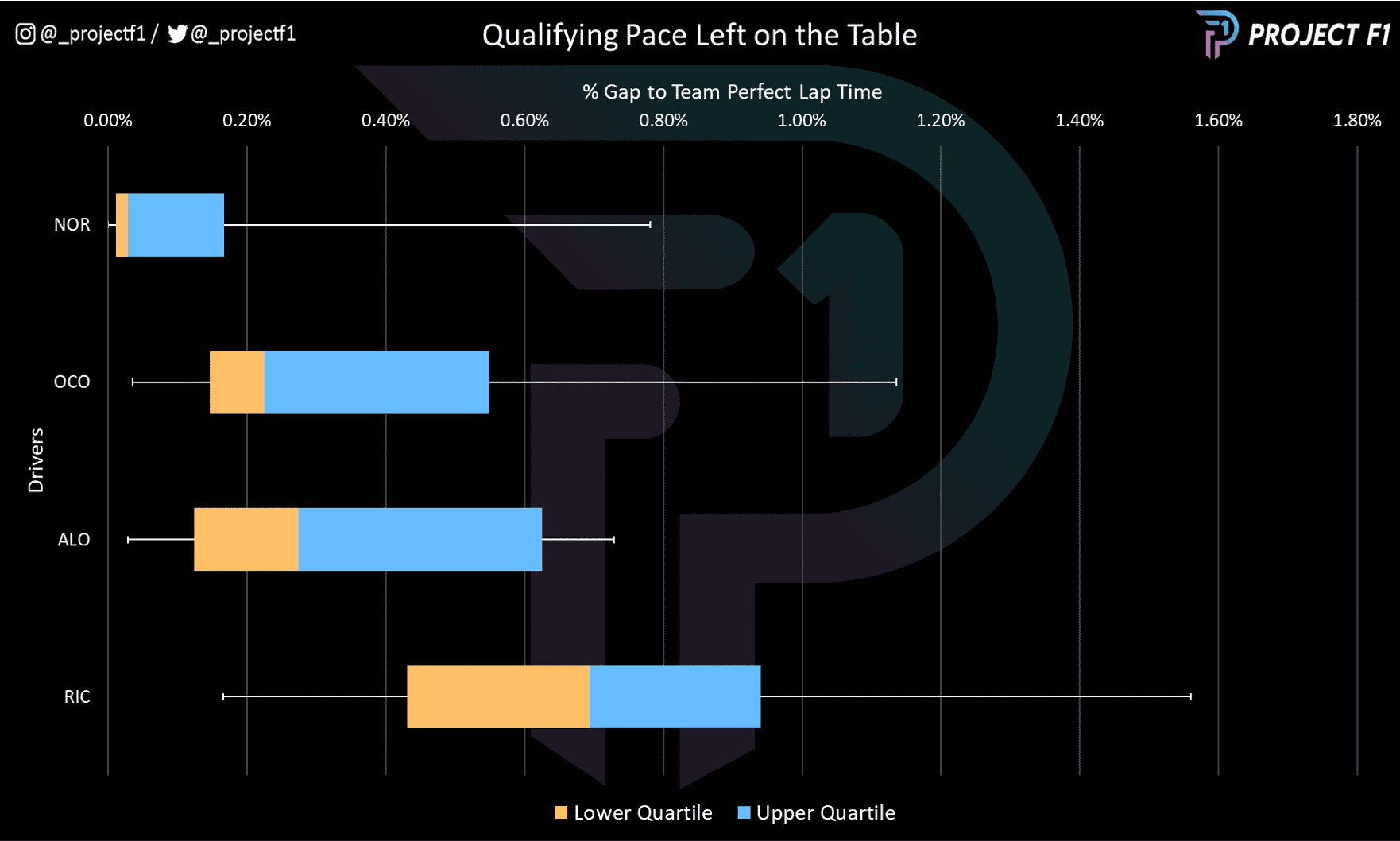
Were the drivers getting the maximum performance from their cars?
Looking at the gap between their classified qualifying time and their optimal qualifying time (based on the sum of their best sectors) would indicate that Norris was the one who got closest to peak performance with the highest consistency.
Next was Ocon, followed by Alonso with Ricciardo tailing – albeit with a large gap compared to his team-mate.
The chart below examines how the time deficit impacted Ricciardo’s qualifying position.
Chart 6: Impact on starting position due to poor qualifying performance
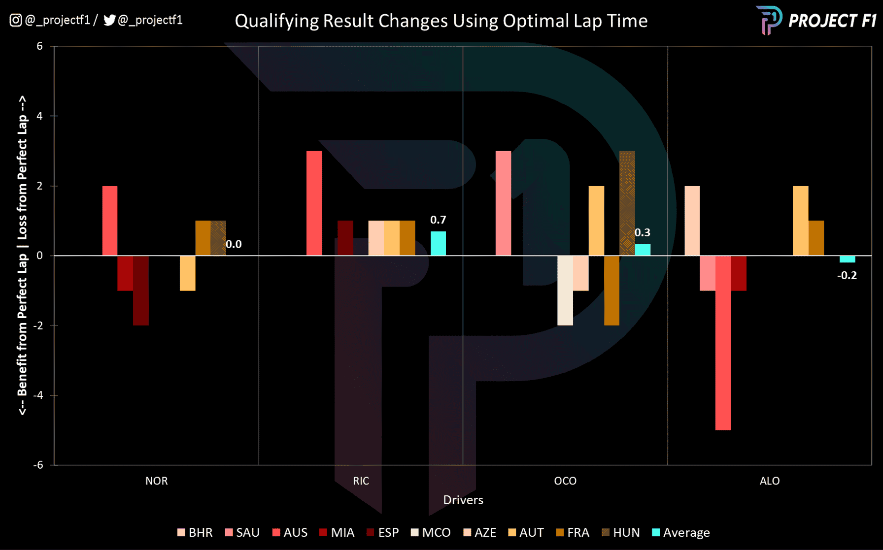
The chart above plots the change in qualifying position had each driver qualified according to their own best sector times (i.e. achieving personal peak performance).
While it is a mixed bag of outcomes for most of the drivers, Ricciardo is the only one who consistently loses position as a result of this alternate qualifying perspective.
This means that Ricciardo would have lost out more had others been more on the pace. While Alonso’s overall average position change was small, his loss in Australia was particularly painful.
So, where is the time being lost?
Chart 7: Where on the track is the car/driver faster?

2022 Bahrain GP – qualifying

2022 Saudi Arabian GP – qualifying
@Project F1

2022 Australian GP – qualifying
@Project F1

2022 Emilia Romagna GP – qualifying
@Project F1

2022 Miami Romagna GP – qualifying
@Project F1

2022 Spanish Romagna GP – qualifying
@Project F1

2022 Monaco GP – qualifying
@Project F1

2022 Azerbaijan GP – qualifying
@Project F1

2022 Canadian GP – qualifying
@Project F1

2022 British GP – qualifying
@Project F1

2022 Austrian GP – qualifying
@Project F1

2022 French GP – qualifying
@Project F1

2022 Hungarian GP – qualifying
@Project F1
Looking at the mini-sectors from the fastest runs in qualifying of each driver across the season so far reveals that the Alpine tends to have the edge on the straights and the high-speed sections of the track while the McLaren has the edge in the medium to low-speed corners.
Further to this, there is a greater frequency of observations attributed to Norris’s pace versus Ricciardo – with Ricciardo tending to feature in the higher-speed sections of the track. Putting this together with the McLaren’s strength in the low-speed and we can start to paint the picture of why Ricciardo is not able to find the lap time needed.
Chart 8: Qualifying breakdown by sectors
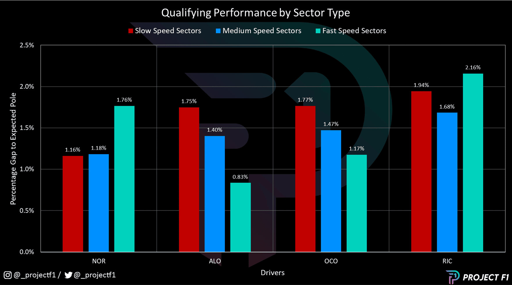
Chart 8 combines the mini-sector qualifying data based on corner speeds. So while McLaren has the edge in the low and medium-speed corners, Ricciardo is unable to extract this performance – likely due to a mismatch in his driving style and the philosophy of the car. Ricciardo’s deficit is smallest in the high-speed sectors.
Alonso and Ocon are quite similar, though Alonso has the edge in the high-speed corners.
So, while the Alpine duo are relatively close in their qualifying pace and performances, there is a vast difference in Norris and Ricciardo – how do things fare in race trim?
Chart 9: Race results
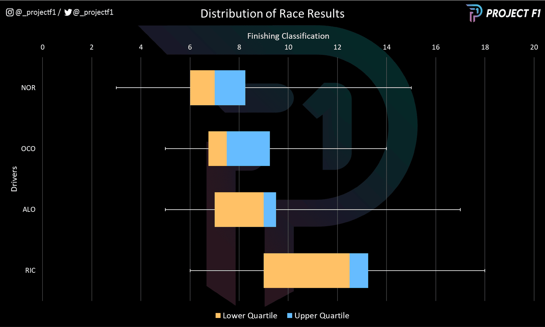
Unfortunately for Ricciardo, in races it’s a similar story to qualifying, with the Australian at the rear of the pack in this comparison too.
While some of this is down to unfavourable strategy for the Australian, most of the impact comes from a poor starting grid slot. This is a severe handicap as it adds further challenges through navigating traffic and extra tyre management considerations.
The opposite of this can be seen with team-mate Norris, who is able to avoid such issues thanks to a generally better starting position. Ocon and Alonso are also able to do better as a result of this. The main advantage for Alpine though is down to the fact that both drivers are in the mix more often than the McLaren duo.
Chart 10: Laps in position
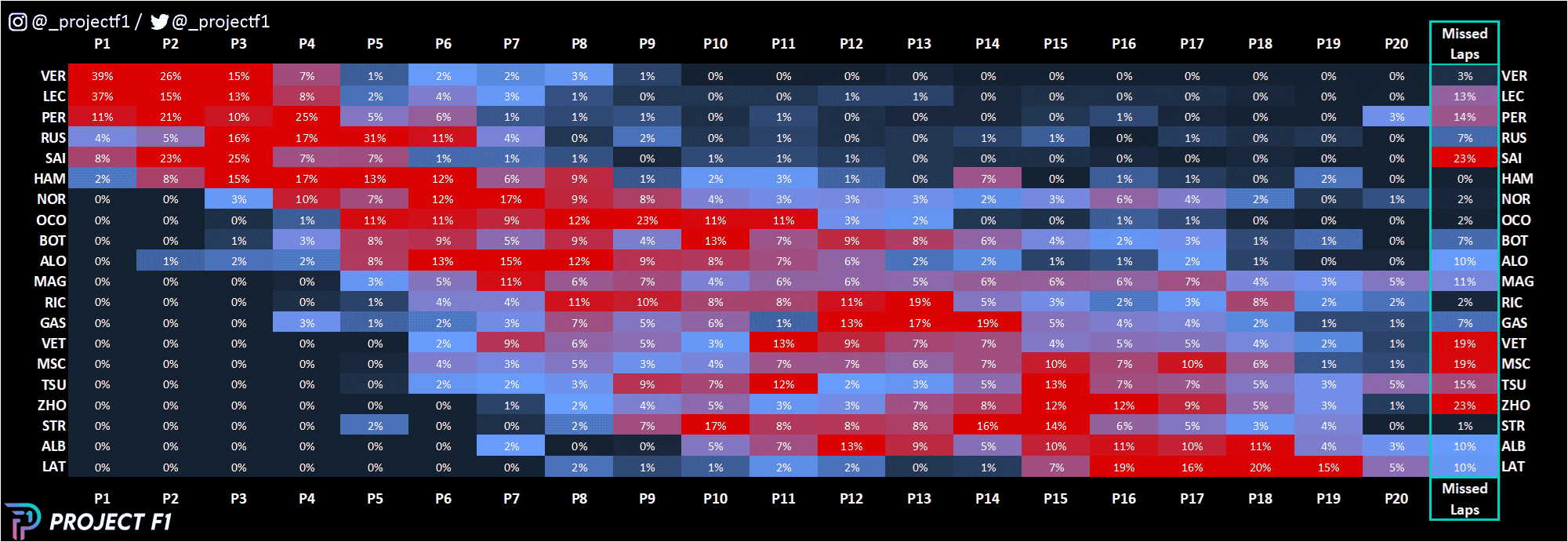
This point is further illustrated above in how Norris, Ocon and Alonso all spend more time in higher track positions (P6-P7) compared to Ricciardo (P8-P9). In fact, Ricciardo’s median race position is closer to P12.
Chart 11: Race pace compared
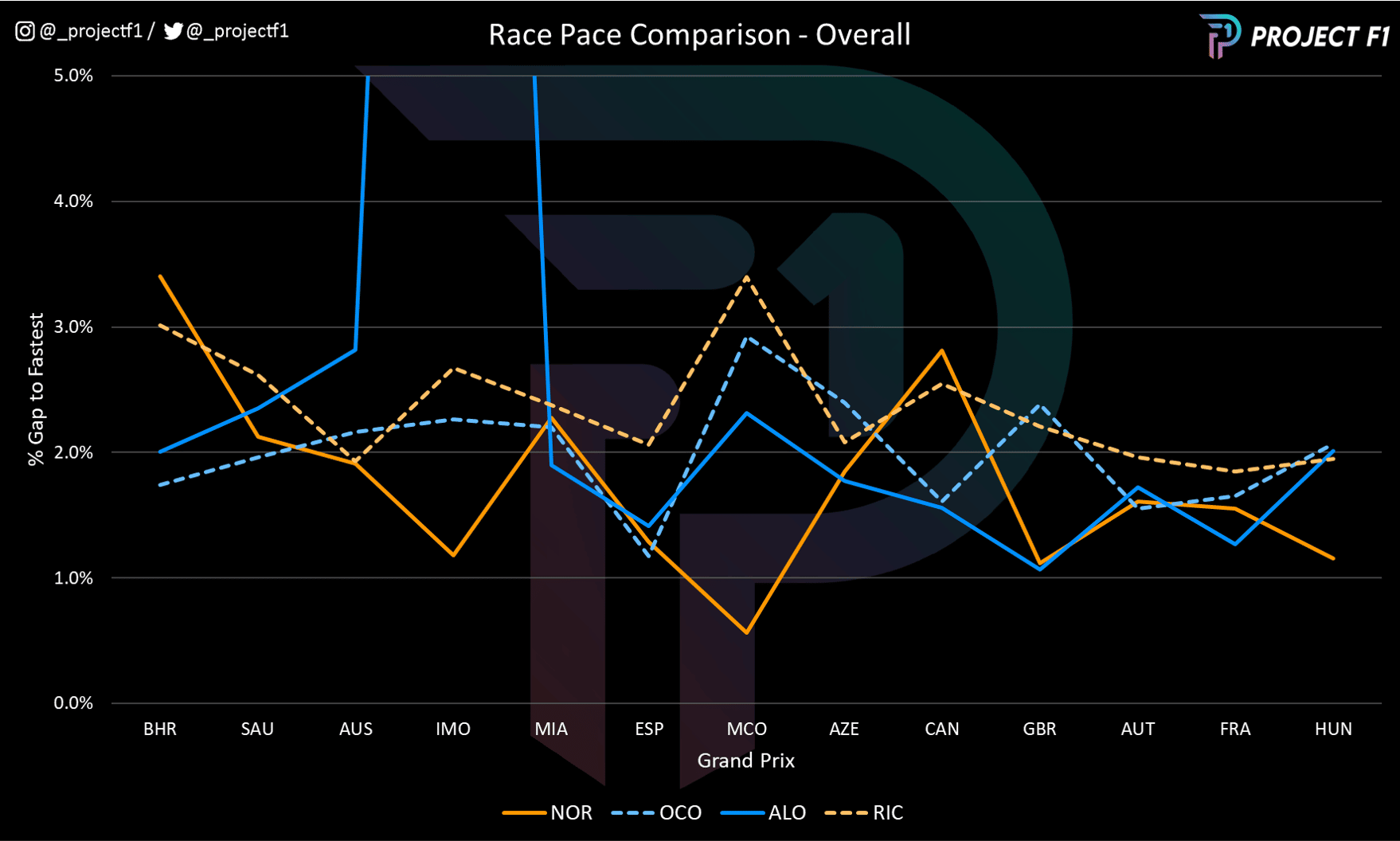
As a result, it’s perhaps no surprise to see that Ricciardo struggles on overall race pace on only compared to Norris but also the Alpine duo. Norris heads thd field in this aspect, with the exception of Miami and Canada.
Ricciardo is consistently lagging with his best performances being in Australia, France and Hungary. The improving trend in the more recent races could be suggestive of some hope and improvement – but it is unlikely to surpass that of Norris.
Alonso tends to have the upper hand on Ocon when it comes to race pace – although Ocon did have the advantage in the early part of the season. However, the gap moves around.
Interestingly, Alpine’s top speed advantage doesn’t carry over into the races – as seen by Norris’s advantage over the Alpines even at tracks such as Austria. This is likely thanks to better tyre deg on the medium and hard tyre.
So where does this all leave us? The data shows that Norris is doing a great job while Ricciardo is struggling to find the pace – and this is mainly down to not being able to generate pace in the slow/medium corners (which is where the car has the advantage).
Ricciardo’s issues in qualifying snowball into a more problematic in the race while the Alpine drivers tend to run more consistently. That being said, car philosophy is also and important factor – with Alpine having the edge at power dependent tracks assuming tyre deg is not a limiting factor. McLaren continues to suffer with drag but has been doing a better job on the tyres. With an even mix of tracks to go, the fight is likely to stay close.
Project F1 turns data into graphics that uncover race pace and strategy
See more analysis at @_ProjectF1 on Twitter or @_ProjectF1 on Instagram